Version 5 Manual
Display Options

The "Display" settings control the general display format of PingPlotter’s graphs, including scaling, coloring, and other general values.
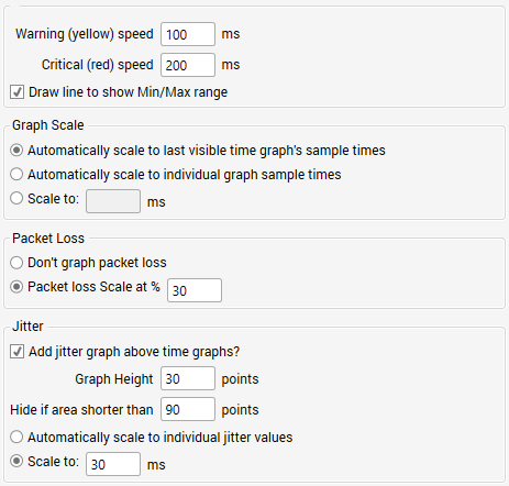
Warning and Critical speed limits
These boxes control the point at which the colors change. By default, all response 200 ms and below will paint green. From 201 to 500 will paint yellow, and over 500 will paint red. These numbers apply to both the HOP column and the graph background. In addition, the legend on the graph screen will be updated with these number.
You'll probably want to change the numbers based on your internet connection speed. If you've got a T1 or a cable modem, the listed numbers are probably pretty good (you might move them down a little if you're tracing to a fast site). If you have a modem, you probably want to crank these numbers up a bit.
Changing these values sets the Green / Yellow / Red threshold for the graphs. This is dependent on your expected performance. For a modem, 200 ms might be quite good, while for a T1, it could be considered bad.
Draw line to show Min/Max Range
Show the Min/Max Line. Hide this line to keep the scale of the upper graph in better range. This line can be useful to understand how a specific hop is responding - for example, if hop 8's minimum point is significantly greater than hop 7's maximum point, then you may need to investigate what's happening between hops 7 and 8. It may be distance (ie: speed of light latency), or it may be a problem with one router, or the connection between those routers.
When showing just a few samples, this can be really handy to see the range of latencies. As you increase your window, though, a single bad sample can make this line stretch the scale of the graph.
Graph Scale
The number shown here indicates the graph scale, in milliseconds (1/1000th of a second).
If the "Automatically scale to last visible time graph's sample times" option is being used, then this number is the maximum response time of only the final destination's sample set. This number can change (and WILL change) as new samples are received. The "Automatically scale to individual graph sample times" will also adjust the graphs automatically - but will scale each graph individually based on the maximum response time for that hop only.
If a fixed scale is being used, this number will always equal that scale. You can change to a fixed scale in the options screen.
Packet Loss
The red number on the right of the timeline graph is the scale of the packet loss numbers. Depending on the number of samples included in the timeline graph, all timeouts may show 100%. For more details, click here.
Most often, graphing the packet loss is a handy, easy way to see lost samples. 30% seems to work great for highlighting just the right of loss in most cases, but you’re certainly going to run into cases where you want to change this to something lower (as low as 1) or higher (any number is valid – even over 100).
Jitter
Jitter is a number that represents how stable the latency responses have been. A low jitter number is usually an indicator of a good connection. High jitter can lead to slow response times, poor voice quality (in Voice over IP) and other connection problems.
PingPlotter Pro allows you to graph jitter correlated with the time graph. In many cases, jitter is apparent when examining the standard PingPlotter time graphs, so the jitter graph is only displayed when there is enough room. The settings here allow you to control when that is displayed, and what it will look like. Jitter is currently only available with PingPlotter Pro (see notice below).
Jitter Graph Scale and Target line
The jitter graph scale controls the range of jitters you expect, and at what point the jitter will go off-scale. Normally, a jitter of much over 60 ms is indicative of a problem, so 60 is a good starting point. Any values over the scale will show with a red line for "overscale".
This graph scale is used in tandem with a "target line" which will be drawn across the graph at the point you specify. This is used to easily identify if jitter is exceeding your target number.
These settings are represented in milliseconds and control the range of jitter values that will fit into the graph.
**Some of the features listed in this topic are only available in PingPlotter Pro and/or PingPlotter Standard. See our product comparison page for more details**