Using PingPlotter
Helping with PingPlotter Share Pages
Congratulations! You are helping someone who understands the need for data to help solve connection issues. If you are the person who recommended collecting data with PingPlotter, then you're pretty smart too. We would like to help you get the most out of the data they shared, so here are a few tips as you review their issue.
Anatomy of a PingPlotter Share Page
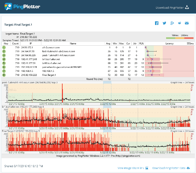
Share pages are designed to make it easier for people to show tech support their network performance information. Here's a rundown of the information you'll find on the page.
Header
The header contains information about when the test took place and what site was targeted.
Target Name
The DNS name of the network destination that was tested. NOTE: Users can edit this name.
IP
The IP address of the network destination that was tested.
Samples Timed
The time range for data included in the test results.
Legend
The scale used to determine which latency ranges are colored green, yellow, or red.
Trace graph
The trace graph displays information about every hop between the user's device and the target destination. Information in this area is based on data in the focus area. Users can select which columns are displayed. Latency values are in milliseconds. Columns can be expanded for sub-millisecond values.
Hop
Hop numbers are color coded according to the legend to show at-a-glance how the hop is performing.
Count
The number of samples received for a hop.
IP
The IP address of the hop.
Name
The hostname or user-created alias for the hop name.
Avg
Average latency.
Min
Minimum latency.
Max
Maximum latency
Cur
Current latency.
Jttr
Jitter (this metric is only available in Professional edition.)
PL%
Packet loss
Latency
A graphical representation of the data in the table. Inside you will find:
- O's for the average of samples in the current focus period.
- X's for the most recent sample in the current focus period.
- Range lines for high/low values on each hop for the current focus time.
- Packet loss % bars for each hop
Timelines
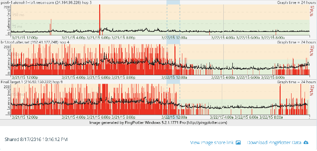
Timeline graphs show how network performance changes over time. The focus period mentioned earlier is set by double clicking these graphs.
Black line
Plots latency over time.
Red bars
Plot packet loss over time.
Below the graph you'll find information about when the test was shared along with a link to share the image, and a download link containing up to 24 hours of PingPlotter data. Downloading the data is useful because you can load the file into your own copy of PingPlotter Standard or Professional for deeper analysis.
Software & Resources
All the tools, documentation, and articles you will need to be successful in troubleshooting network problems are right here.
Downloads
- Free 14 day trial of Standard & Professional
- Free edition for users to gather data and share it with you.
Become a PingPlotter Partner
We want to make network troubleshooting suck less for you and your users. Our PingPlotter Partner Program is designed to help your users with support, crowd-sourced support, and data collection for your support team. Contact us for access to benefits including:
- Unlimited downloads of the Forever Free version of PingPlotter for your users.
- Unlimited creation of PingPlotter share pages hosted on our servers.
- Custom partner resource page in our solutions directory for your product or service.
- Dedicated partner manager to help build the best solution for your users.
If you're interested in becoming a PingPlotter Partner, please contact partner@pingman.com.
Do you support other people?When remote workers have connection trouble PingPlotter Cloud helps you help them.


