Legacy Manual
Interpreting Results - ISP Problems
For this example, we're assuming the role of a user that's having problems with a broadband connection. What we'll be taking a look at is a few days worth of trace data. One thing to keep in mind is that if you're doing long term monitoring and want to look at more than the largest default time span on the time-interval graph (48 hours), you can add custom time intervals in the pingplotter.ini file located in PingPlotter's installation directory.
Before continuing, if you're not familiar with how the graphs work in PingPlotter please make sure you've read the introduction to graphs earlier in this tutorial.
One common mistake we see folks make is that they'll trace to their ISP's border router. This is a bad thing. If you're tracing to the border router and your route changes (i.e. they take that router down for maintenance or you get load balanced onto another router) you really have no idea what happened. If you want to keep your traces local to your ISP, trace to an address that isn't going to change on you like you're ISP's mail server. This is actually a good thing to do if you're having mail problems and it's your ISP's mail server going down. Otherwise just pick a destination that you know has a reasonably good chance of always being up. This is a better choice since routes within your ISP can change, and PingPlotter keeps track of those route changes. The cool thing is that you're doing a traceroute here, not a ping, so even if that destination host goes down you can drill down on the timeline graph and see if it's your connection, or if it's just the destination being down (as in all hops but the destination don't show timeouts).
Another problem with tracing to your ISP's border router is that your ISP will not respect the data that you collect this way. No application targets a border, so they have no reason to trust this data. For best results, you want to pick a target that is one you use and are having problems with.
Note: For clarity, all the graphs below show us ignoring Hop 1 which you to can do from the View Menu. All the graphs were saved with the File/Save Image command within PingPlotter then converted to .gif for this tutorial.

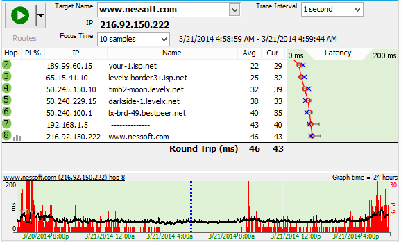
This first graph shows what the traceroute should look like with no load on the connection, i.e. no downloads, streaming audio, on-line game playing, etc. "What about all that red on the history graph? I thought red was bad?", you ask. Actually red is bad, however before we saved out this graph we double-clicked on the timeline graph to drill down, or zoom-in, and are looking at the data for 3/21/14 at 4:58 a.m. If you look at the top of the graph you see the "Focus Time" is set to "10 Samples," and the range is between 3/21/14 4:58:59 AM - 3/21/14 4:59:44 AM. So basically the above graph's trace for that particular time looks good. However when you look at the timeline graph, you can start to see the tale of woe. What we have here is a really flaky broadband connection. So how do we prove it? Read on.

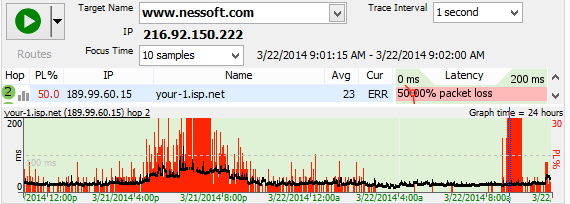
Just sending your ISP a graph with red lines isn't very convincing. However, when you start zooming in on those sections with timeouts, and send graphs of them as well like this second saved graph, it's pretty obvious the connection's hosed when you can't see out to Hop 2. This is the same time interval as the first graph, just showing a different period in time for trace data.

For our third graph we've got data for early on the second day of our trace. Lots of red, and when we focus on the 9:01 AM time period the connection's still poor. We're unable to see out most of the time. It's hard to argue with the graph. Also keep in mind that what we're showing here is that the whole timeline graph isn't solid red. This isn't an issue where you accidentally kicked the plug on your router.

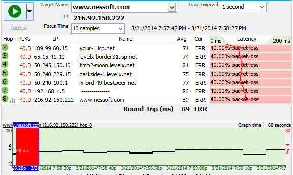
For our fourth graph, you can see from the timeline graph's times that we've adjusted the time-interval so we're only looking at 60 seconds worth of data. The trace graph is showing the section of the time-interval graph that we double-clicked on which is 7:57:42 PM to 7:58:27 PM. So what's up with the 40% packet loss showing up on the trace graph? Notice that we didn't have timeouts for about a full 50 seconds (out of 60) on the timeline graph . Out of the ten samples we're looking at, 40% of them were timeouts. This is important. When we're looking at the trace data we're looking at those 10 samples we selected and the numbers for those samples, not the whole range of data shown on the timeline graph! This is not a graph you want to send to technical support. All it's going to do is confuse them.
So in summary, PingPlotter allows you to show your ISP where the problem's are. In the these examples, we were essentially showing the whole link going down. However, we could've just as easily seen if the ISP's connection to the Internet was down at Hop 4, because we were tracing to a destination not on our ISP's local network. If there was indeed a problem at Hop 4, we would've had good trace data at Hops 2 and 3, timeouts at Hop 4 and possibly no trace data past Hop 4. If the router at Hop 3 was being flaky, and for instance you saw a lot of packet loss, it's easy to save an image showing just that so you can email it. When sending graphs to your ISP, we've found it's best to send one graph showing data for an extended time period, and then drilling down on the timeouts and sending graphs that truly show them what's going on. PingPlotter allows you to save in .png or .bmp format. We recommend .png because they're smaller.